Data42
Team
CTO, Engineering team
UX/UI Designer (Me)

Overview
Data42 is a comprehensive, data-driven platform designed to empower maintenance teams with the tools they need to run operations efficiently. By leveraging real-time data analytics and predictive maintenance, Data42 helps teams minimize downtime, optimize resource allocation, and improve decision-making.
Challenge
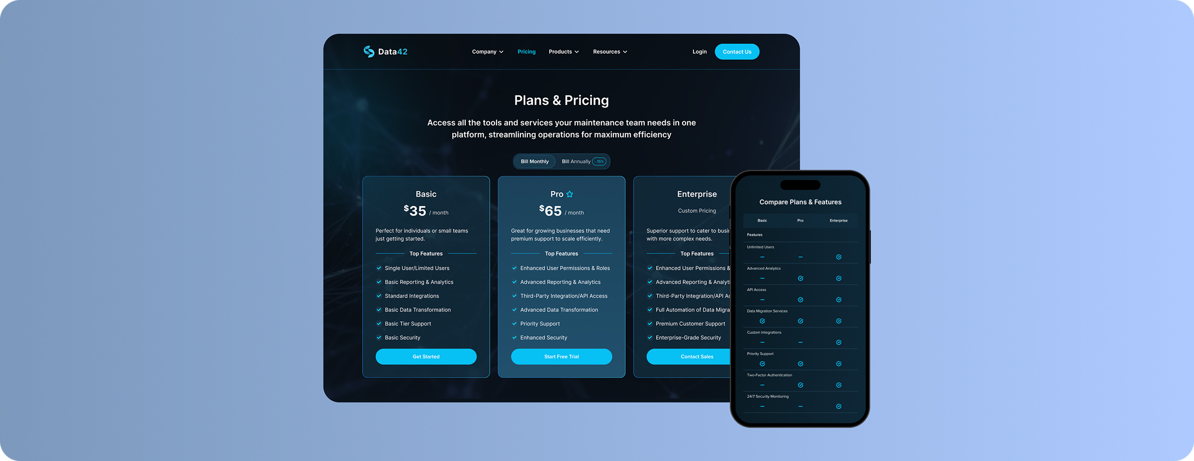
My mission was to design a Pricing page that includes a clear, well-organized comparison table to showcase the unique features and benefits of each plan. This layout helps users quickly understand the value of different price points, simplifying their decision-making. Without this clarity, users could miss key differences between plans, making it harder to appreciate the value of higher-tier options. Additionally, I optimized the table for mobile screens, as most users access our website on mobile devices.
Design Process & Solutions
We conducted a research to gain insights into our competitors' strategies, strengths, and weaknesses. This analysis allowed us to better understand how they position their products, engage users, and differentiate themselves in the market. I used Figma to develop mockups, also evaluated the responsiveness and usability across various devices to ensure a seamless user experience.
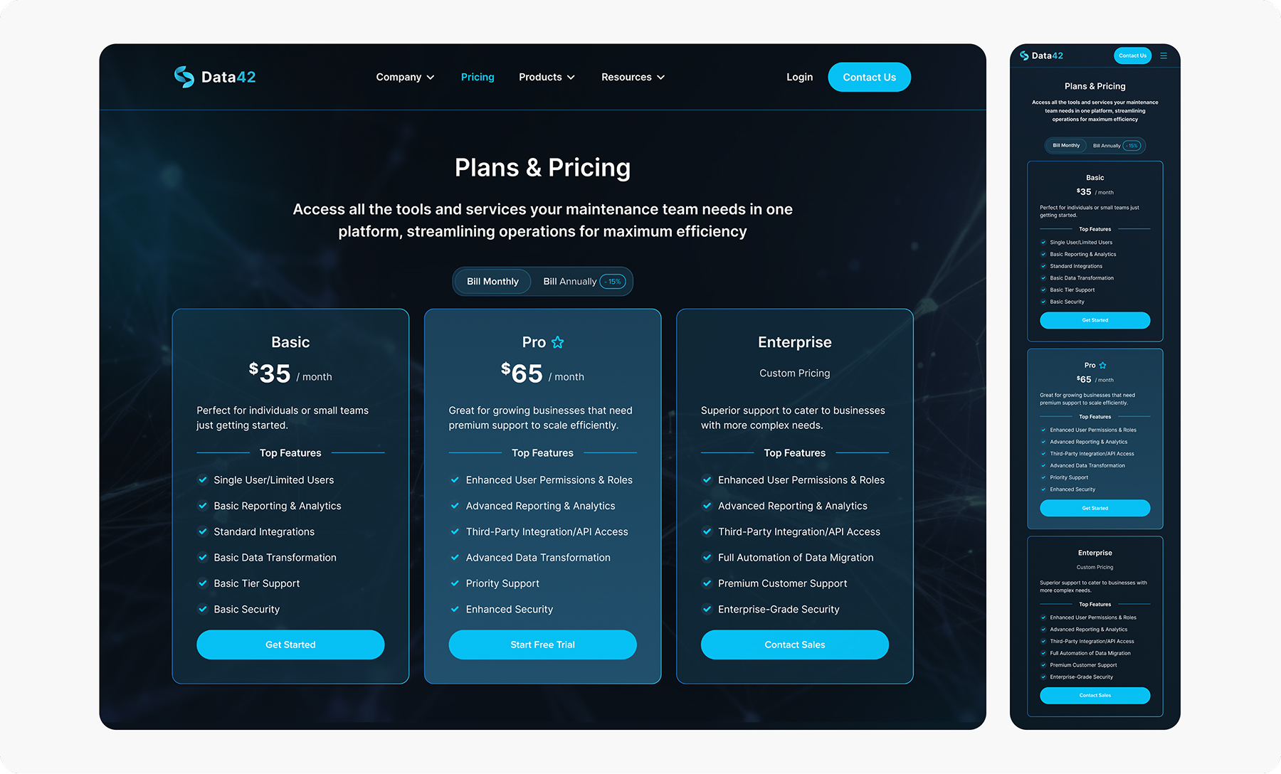
We included a Free trial that lets users experience the product firsthand without any financial commitment making it easier to try the software. Switch button enables them to toggle between monthly and annual pricing plans. For mobile screens, I arranged the plans in a vertical layout, displaying them one below the other rather than using a carousel, to ensure full visibility.

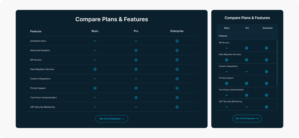
The pricing comparison table that displays all the features for each plan, making it easier for users to compare and choose the most suitable option.
To optimize the table for mobile devices, I proposed a minor adjustment to eliminate horizontal scrolling, which proved effective. Additionally, the plan headers are sticky, ensuring they remain visible while users vertically scroll through the table, enhancing the overall user experience.

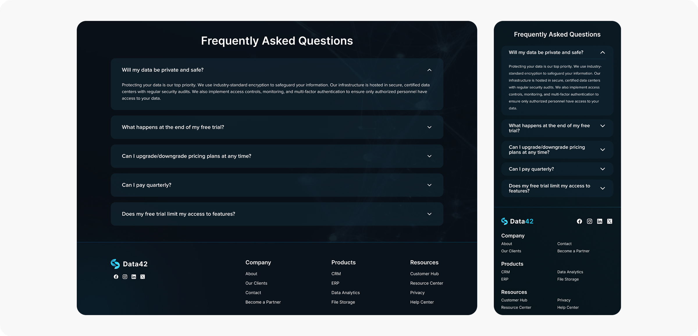
We also added FAQ section since it's convenient for users to see questions regarding plans usage, without leaving the pricing page.

Outcomes
With the implementation of more transparent pricing plans, we observed an increase in the bounce rate. This suggests that users may be seeking clearer information on pricing options before making a decision, highlighting the importance of transparency in our pricing strategy.
