Décorivva
Role
UX/UI Designer
Team
PO
UX/UI Designer (Me)
Duration
1 Month
Decorivva image
Overview
Décorivva is a mobile shopping app that empowers home-decor enthusiasts to discover, evaluate and purchase pieces with minimal friction. It guides users through three steps: Cart - Shipping - Payment, using persistently visible cost breakdown. Users can adjust quantities right in their cart, confirm or edit billing and delivery details with a single tap, then choose a payment method, ensuring transparency at every stage.
Challenge
Over half of mobile users dropped off at checkout because shipping fees appeared too late and the multi-step form felt long on small screens. The goal was to show all costs up front and condense checkout into three simple, thumb-friendly steps.
Design Process & Solutions
On the Create Account screen, we placed a bold, benefit-driven subheading 'Sign up now, get 30% off your first purchase', directly above the form to capture attention the moment users arrive. By leading with a tangible reward, we tap into users' desire for instant value. It aligns perfectly with the app's core goal- encouraging a first purchase so users feel they are gaining something right away instead of simply giving up personal data.
To enhance product discovery and personalization, we introduced a dedicated Wishlist tab in the bottom navigation. This gives users one-tap access to their favorite items and lets them keep track of flash sales or price drops without hunting through the catalog.
Additionally, our user interviews and usability testing revealed that shoppers often struggled to narrow down hundreds of décor options. In response, we designed an advanced filtering panel, allowing users to sort by category, style, price range and materialy. By placing these filters prominently on the search screen, we reduced time-to-find and increased engagement with long-tail inventory.
In addition to our full filter panel, we added quick-filter pills—like 'Popular', to reduce cognitive load and let users jump straight into browsing products. Beyond 'Popular' adding sibling pills like 'Trendy' or 'Special Offer' invites users to explore discoveries drive engagement and keep the experience feeling fresh.

Each product card carries a heart-shaped 'Wishlist' icon: tapping it adds the item to your personal collection, and any already-saved products display a filled heart (plus a 'Saved' badge) right in the list. This makes it easy to build, browse and manage the Wishlist without leaving your discovery flow.
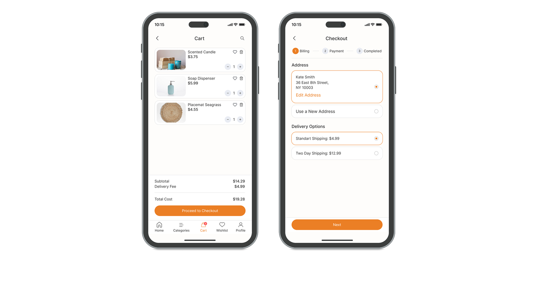
We made a cost breakdown (subtotal + delivery + total) for price transparency. Shipping summary and delivery fee right under the progress bar keeps costs visible. 
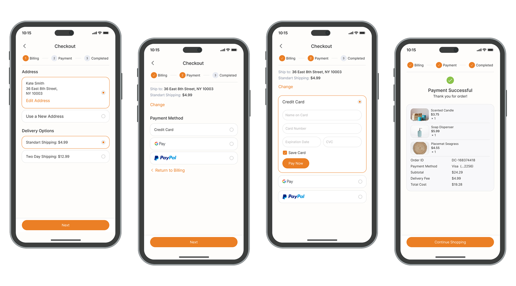
I suggested to include a horizontal progress tracker to show the full checkout process: Billing/Delivery - Payment.
Back to Homepage