MedHub
Role
Product Designer, Web Designer
Team
Product Manager, Engineering Team

Overview
The web application provides in-depth analytics for medical influencers. It allows users to search and filter influencers' social profiles using advanced criteria.
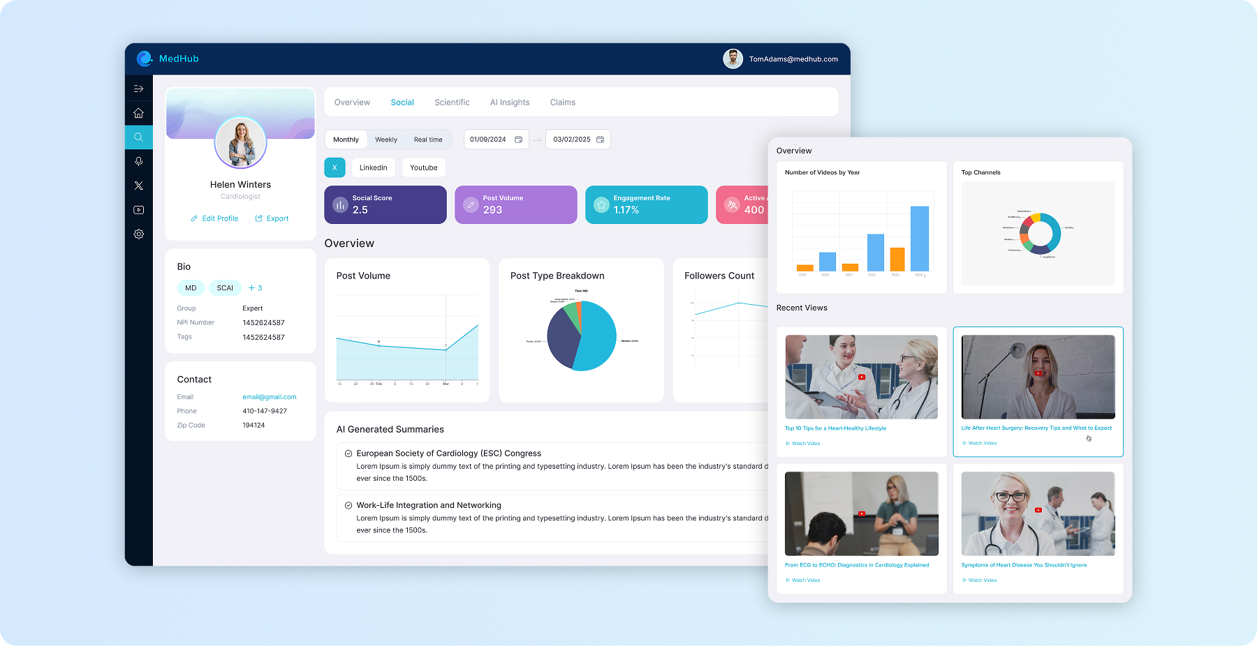
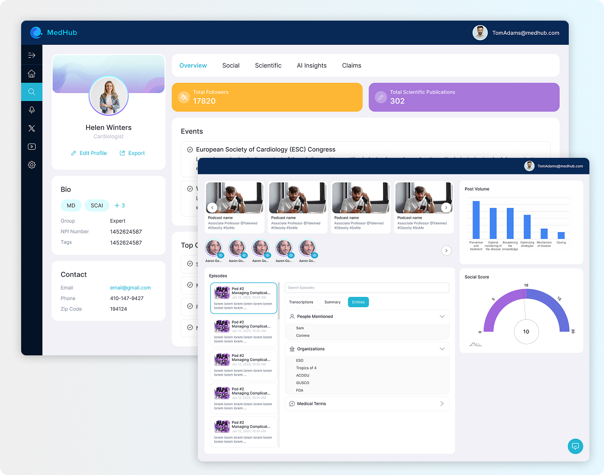
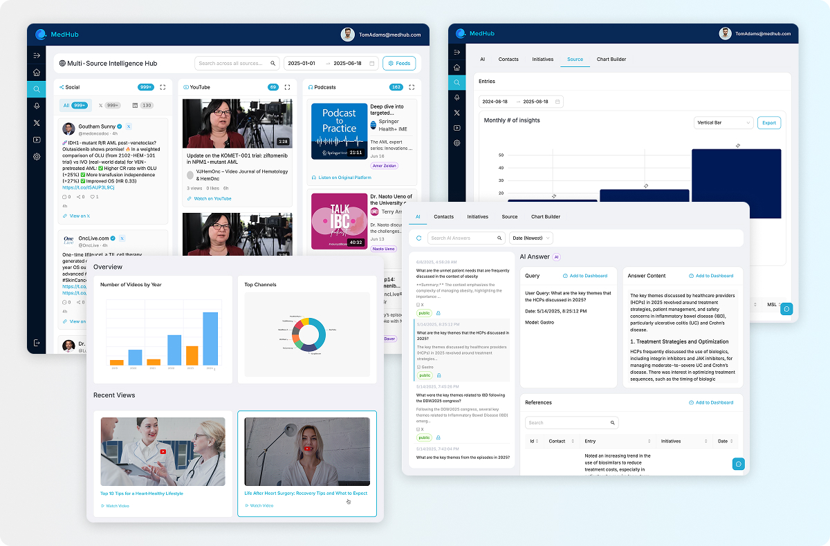
The redesigned application offers comprehensive dashboards showcasing social activity, engagement scores, follower counts, and other key insights.
Challenge
Before redesign, the previous application faced several design challenges, including poor dashboard visibility, inconsistent navigation for search results,
performance issues with loading large datasets and the absence of a design system, leading to UI inconsistencies.
My mission was to redesign the application to enhance usability within a tight timeline, create a design system to ensure consistency and address performance and navigation issues for search results.
Design Process & Solutions
We conducted competitive research to identify opportunities for improvement. Following this, I began the prototyping phase, using Figma to develop mid-fidelity wireframes to gather feedback on the user experience.
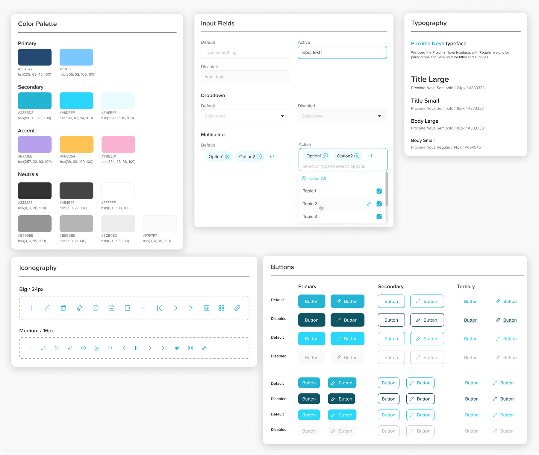
Following this, I initiated the development of a design system for the app to establish a scalable design architecture, ensure brand consistency and streamline future updates. I then refined the prototypes into high-fidelity versions, incorporating the feedback received to deliver polished and user-centered designs.

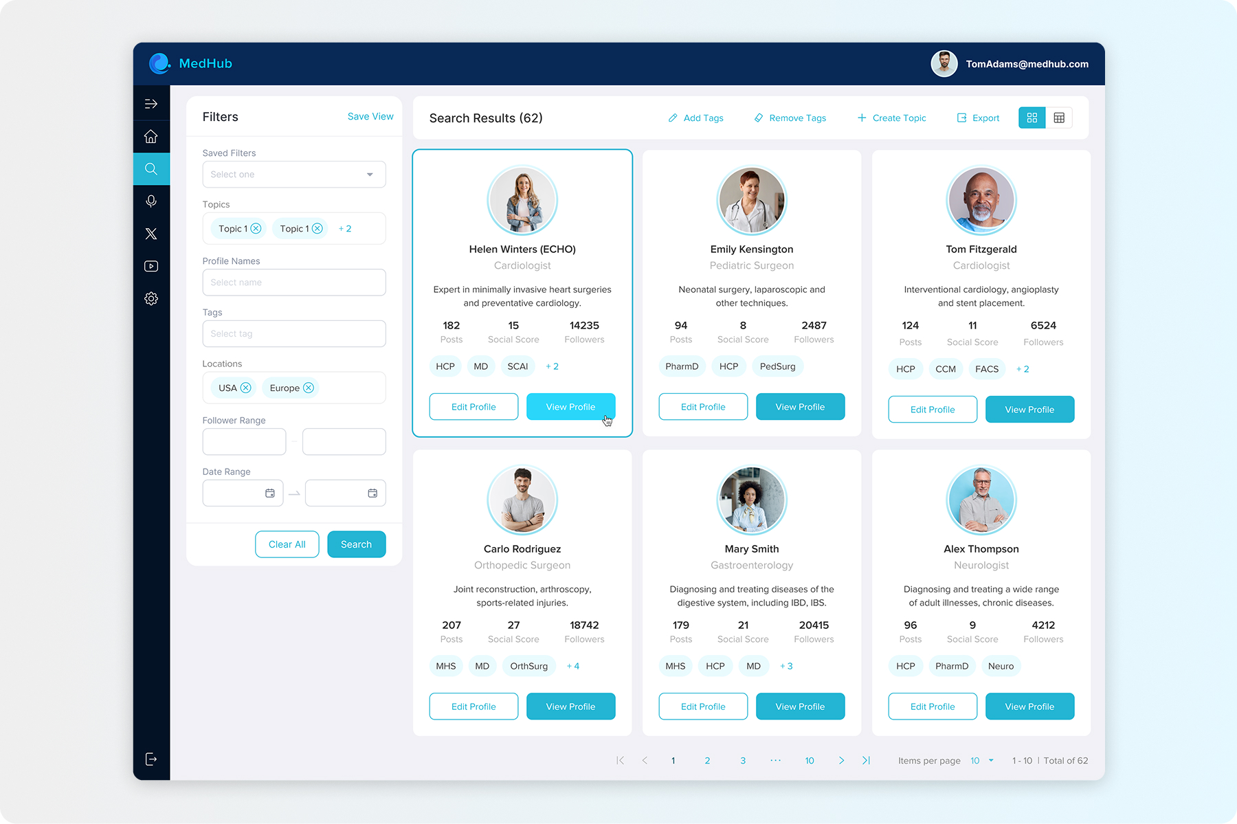
The influencers' search section was redesigned to offer both grid and table views, allowing users to choose their preferred method of data presentation. Some users reported performance issues due to all profiles being loaded simultaneously, which required them to scroll infinitely to see all the results. To speed up the display of search results, two options were considered: pagination or a 'Load More' button.
With the 'Load More' only a subset of data is initially loaded through lazy loading, which reduces the initial wait time and keeps users engaged as they scroll or request more results. However if users wish to return to a specific set of results, they may need to scroll back down, which can be frustrating, especially for those comparing profiles.
So we implemented Pagination to improve control and performance. It allows users to navigate between pages quickly without loading excessive data, limiting the number of profiles displayed at a time.
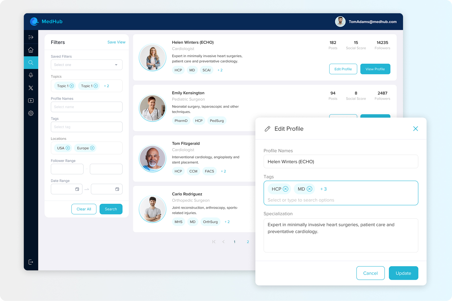
User can edit the profile either before visiting the full information page or afterward. All changes made to the fields will be saved to the current profile for your future searches.


Before the redesign, analytics information was displayed below the filter fields, limiting space and requiring users to scroll down to view all details. In the redesign I adjusted the layout by positioning the influencer's profile on the left and the analytics dashboard on the right. This layout keeps the profile visible at all times while providing sufficient space for displaying analytics.


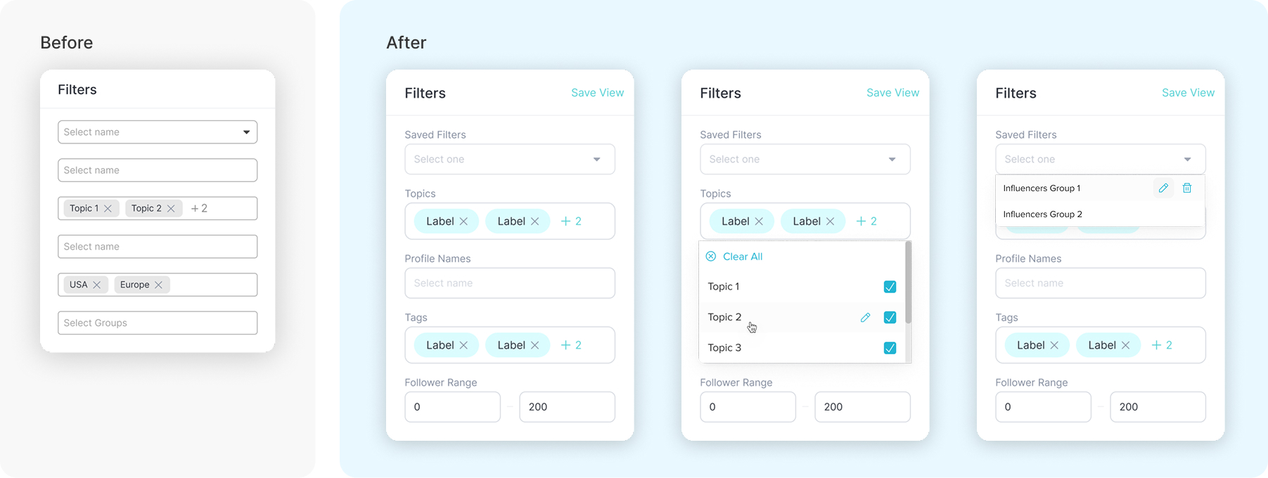
The input fields everywhere in the system relied solely on placeholders, making it difficult for users to identify their inputs after entering values, particularly when using multiselect options. We placed labels above the input fields to help users understand the context of their entries while keeping the inputs clearly visible. Additionally, we evaluated options for adding edit and delete buttons for certain fields.

After finalizing the app's UI/UX design, I collaborated closely throughout the development phase to ensure a precise, pixel-perfect implementation. I also used my skills in HTML/CSS to contribute to building interactive components that aligned with both functional and design specifications.
Outcomes
The redesign significantly improved the user experience by streamlining navigation, enhancing performance, and implementing a more intuitive layout. These changes ensured smoother data input, improved visibility, and a more user-friendly interface.
